Herbionik and Bionik packaging redesign
Client
Deliverables
Context
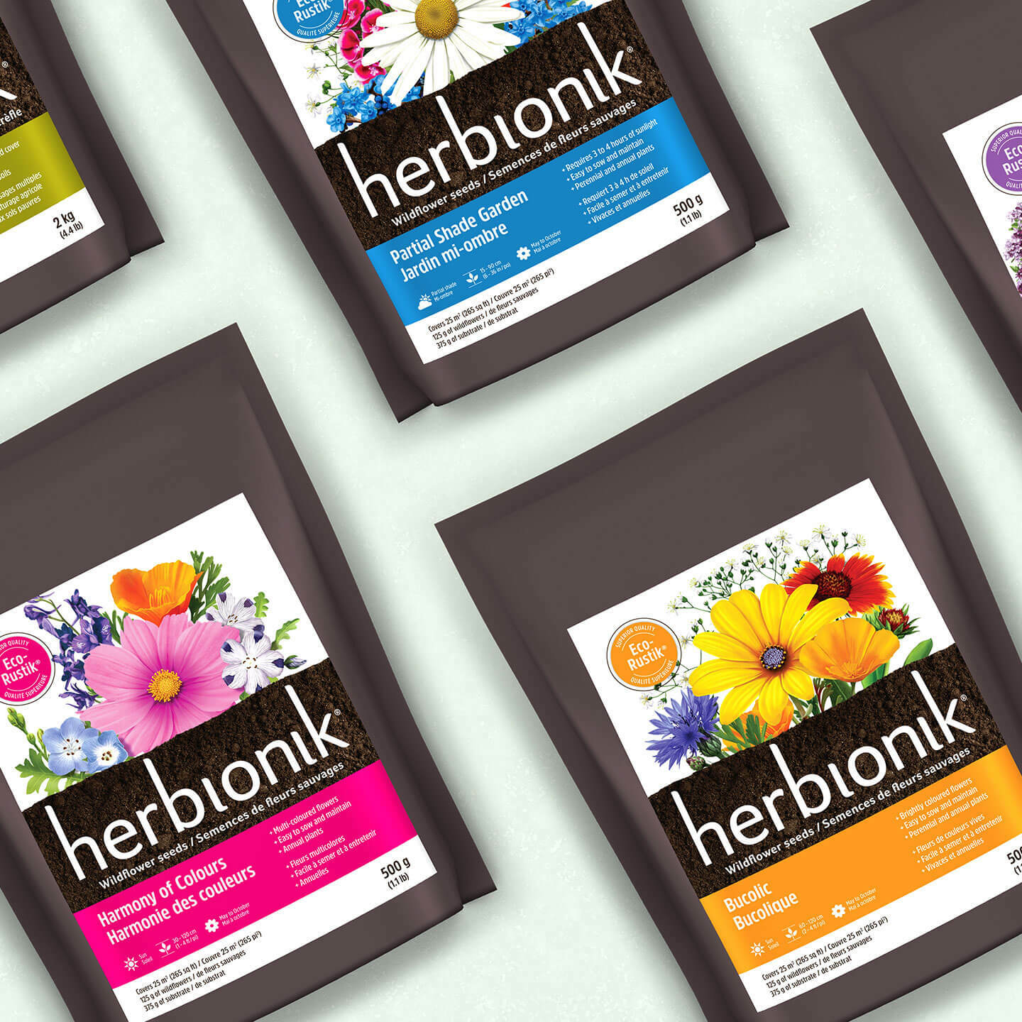
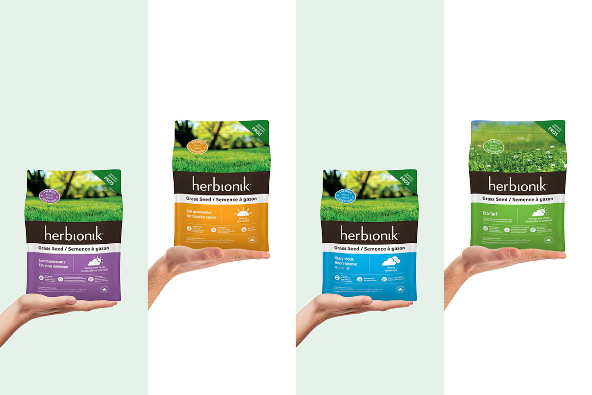
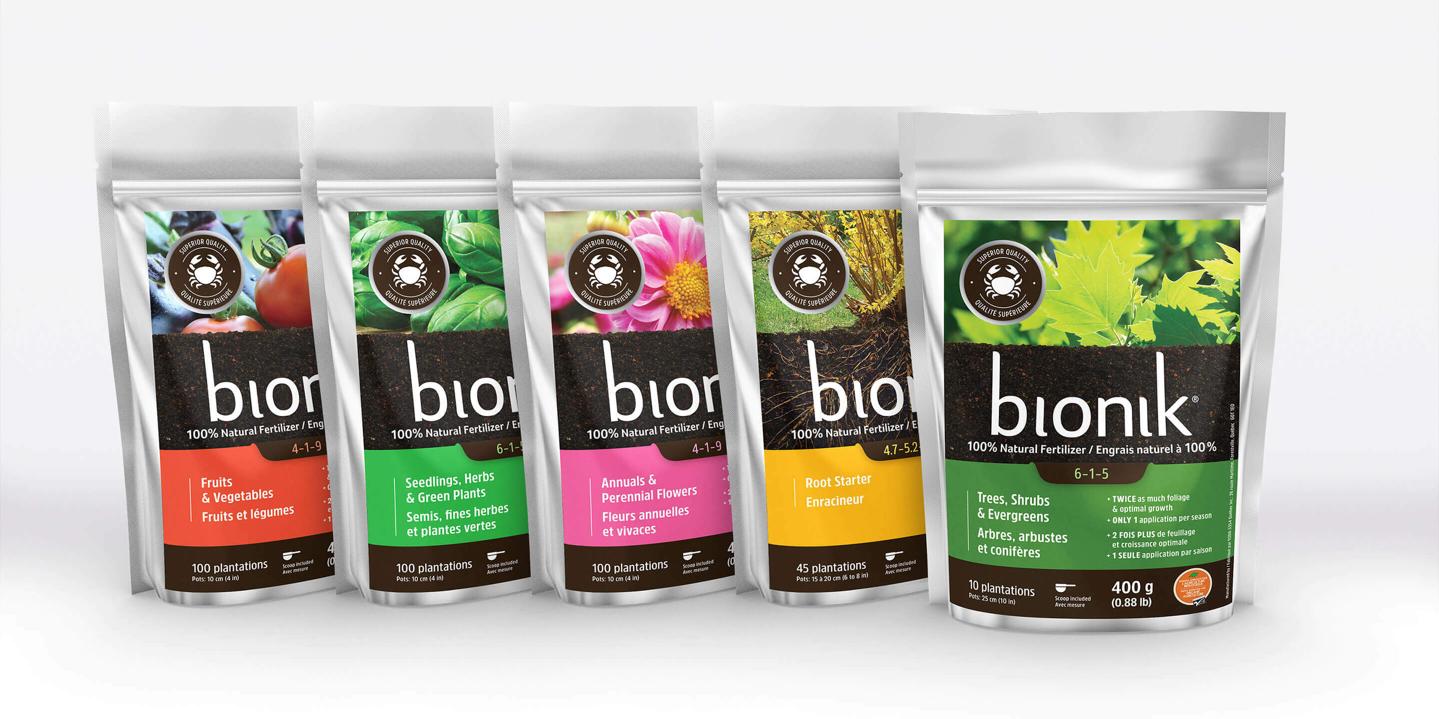
Gloco was looking to update and modernize the packaging for their Herbionik and Bionik products, with an eye toward the brand’s short- and long-term development. The redesign needed to visually connect the two lines and highlight the properties of the products.
Process
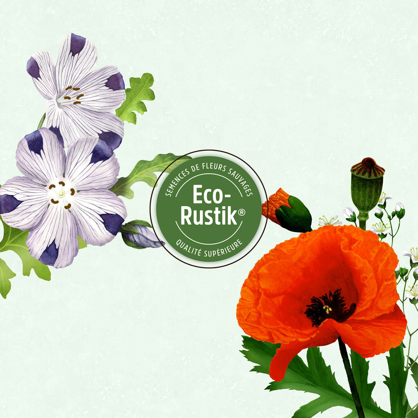
By developing a layout based on eye-catching graphic elements, Dyade presented the product lines and their qualities in a vibrant and attractive way. The information on the packaging was restructured in a clearer and more visual format to showcase the products’ benefits and technical aspects. A Québec artist also collaborated on the project, creating illustrations of wildflowers to differentiate the seed mixes and depict their contents.
Result
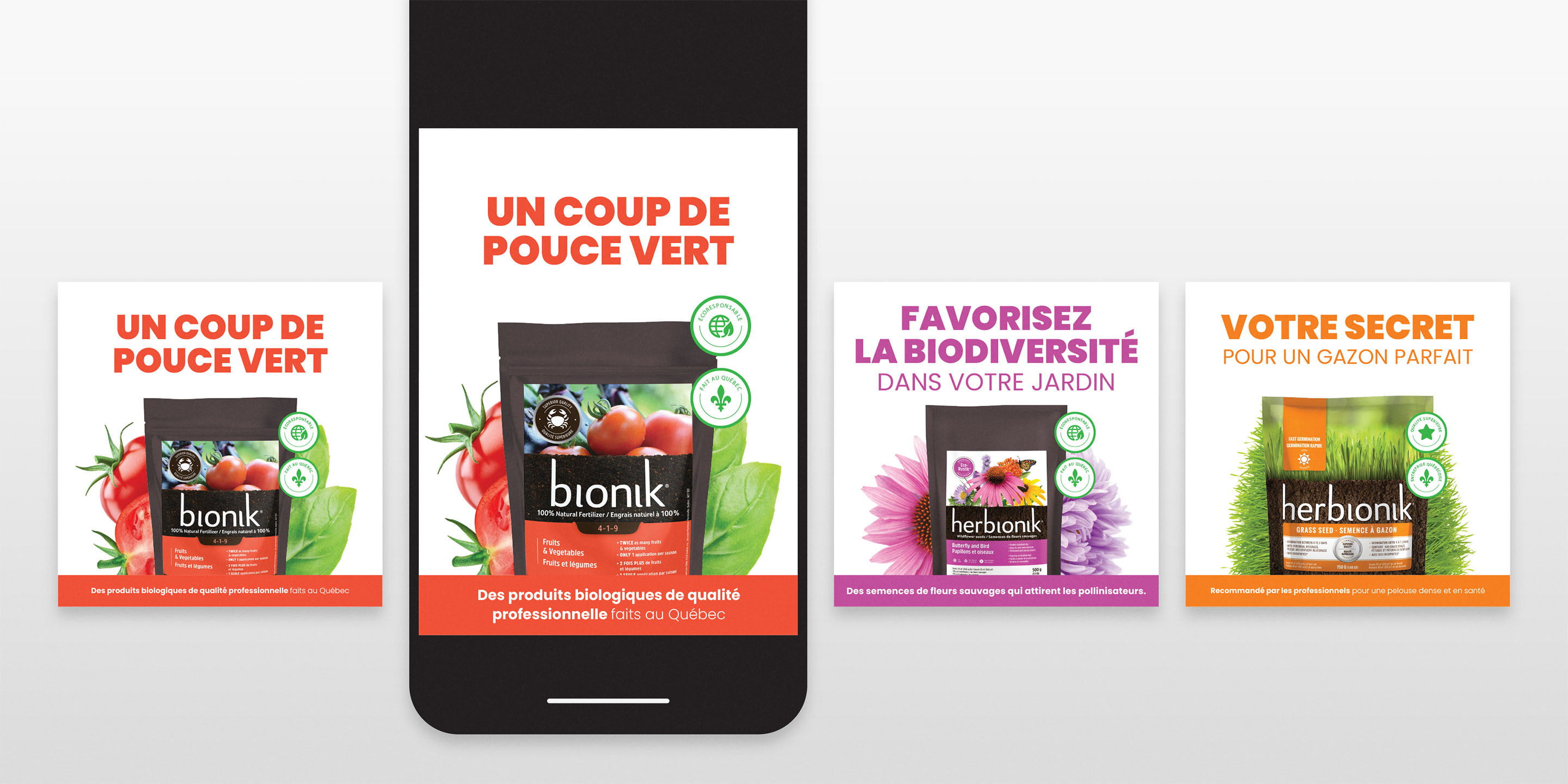
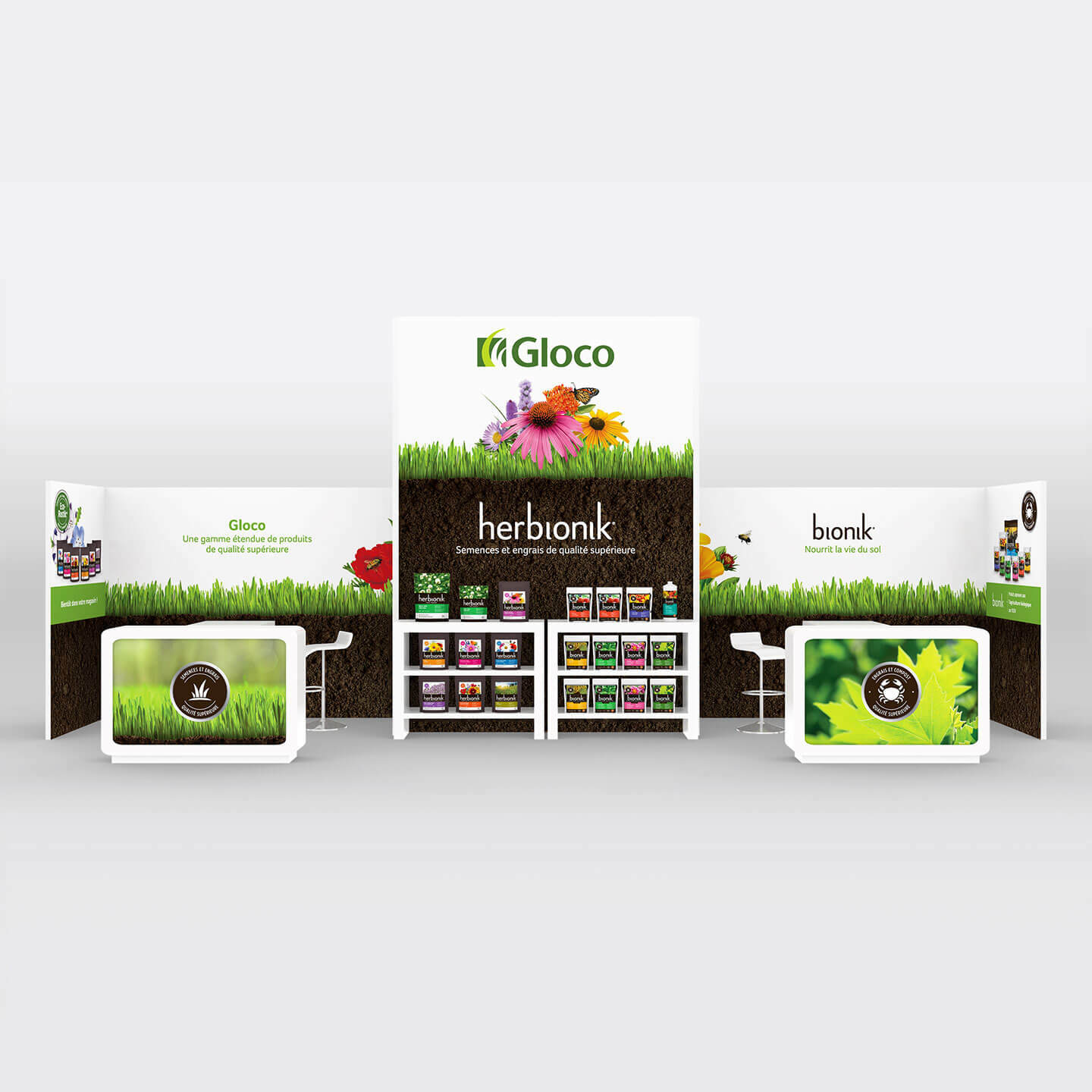
A family business with two distinct lines totalling some thirty products, Gloco can now leverage a portfolio of brands that are well positioned for the future and which speak to the quality of its products. The end result: contemporary and distinctive packaging that not only helps inform consumers, but also stands out on shelves. The new visuals were also deployed in the design of an exhibition booth.
