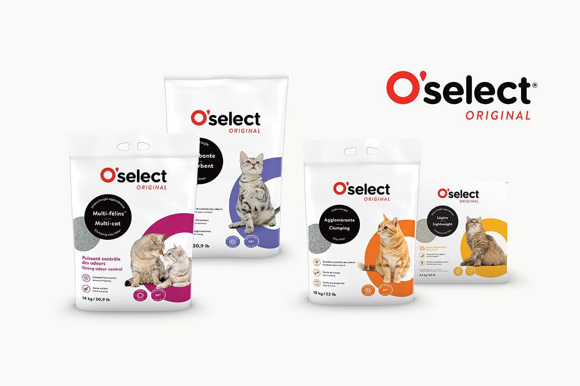
Overhaul of the visual identity for the O’select line
Client
Deliverables
Context
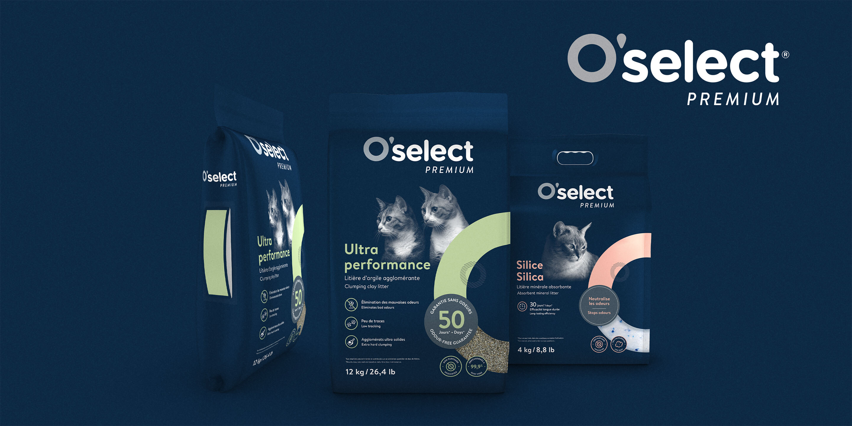
With the goal of attracting new customers and repositioning the O’select brand by shifting away from food products, Mondou commissioned Dyade to design an updated, sleeker logo and packaging in a style that’s cohesive, easy to recognize and adaptable for the three O’select sub-ranges.
Process
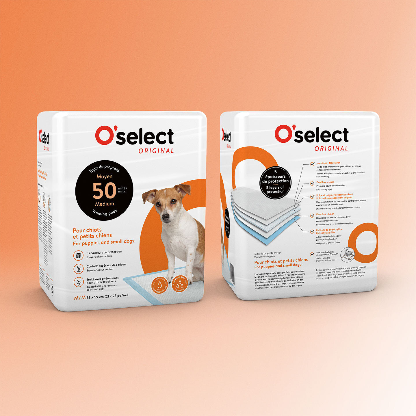
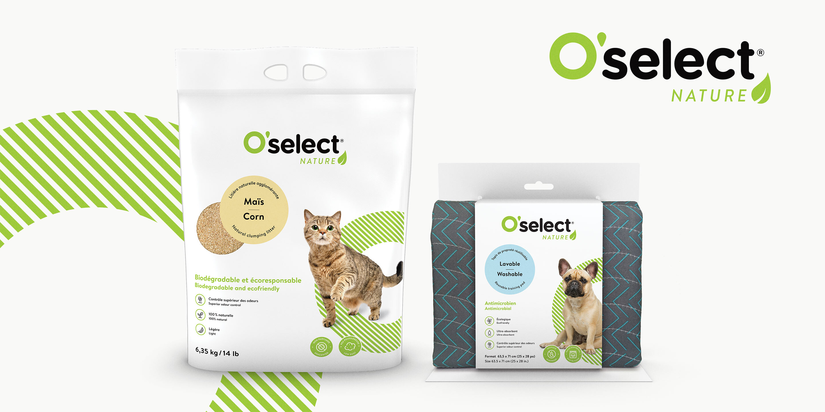
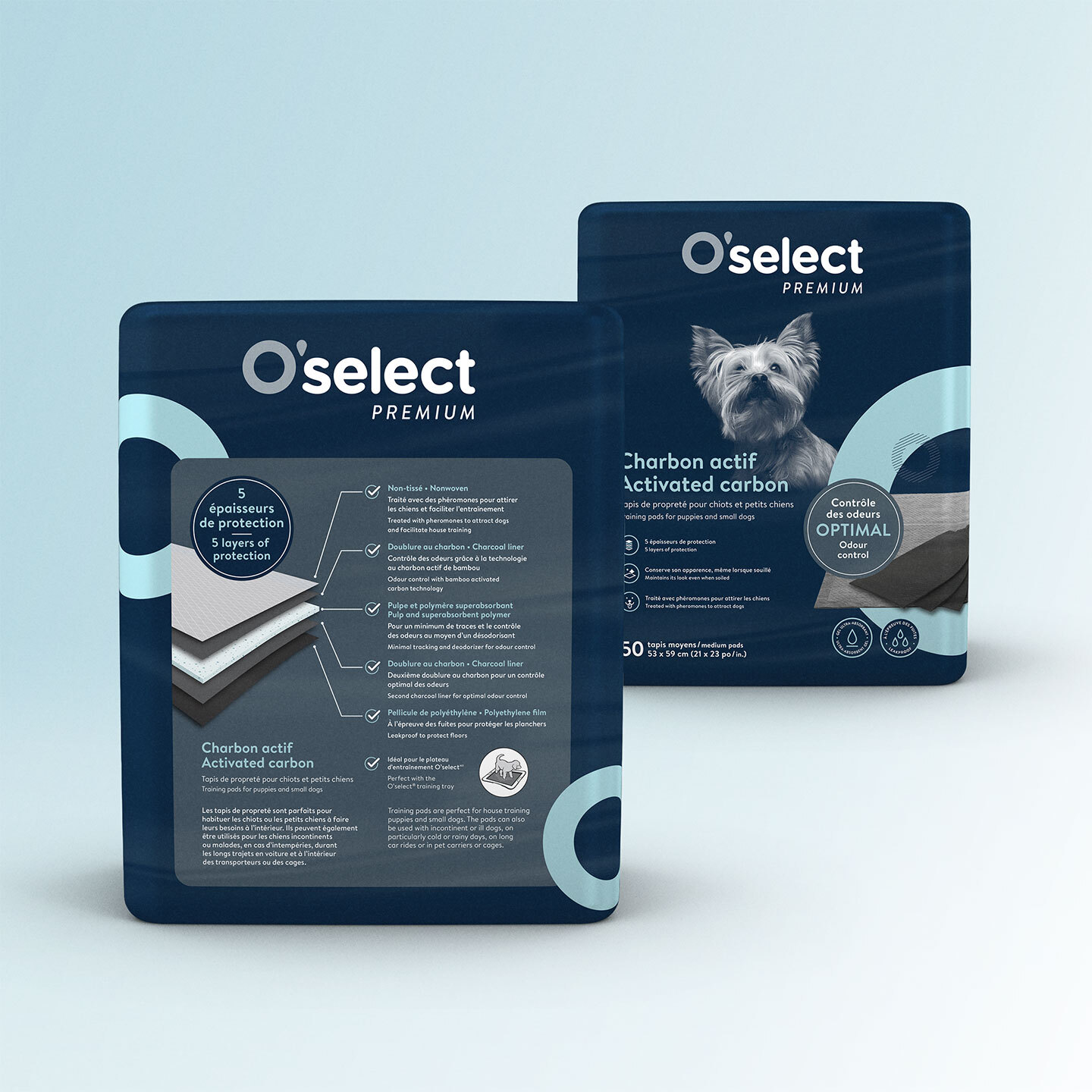
Working closely with Mondou, Dyade first modernized the O’select logo. The O was given a more expressive shape and each sub-range was given a distinct colour to easily distinguish them. Dyade designed visually appealing packaging with colourful and vibrant pictograms to help the line stand out from competitors and simplify consumer options. The new visual identity also seeks to attract a younger clientele.
Result
An updated, attractive and sleek visual identity with distinctive sub-ranges forming a cohesive line on store shelves.
