Logo and standards guide
Client
Deliverables
Context
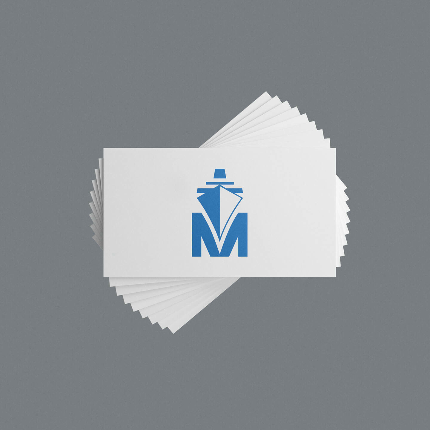
The Montreal Port Authority was looking to streamline and update its logo while preserving the Port’s core symbol: a ship carving through water, forming the “M” in Montréal. The logo’s bilingual nature, which required the Port’s symbol to be combined with its two official names (in French and English), further complicated the project.
Process
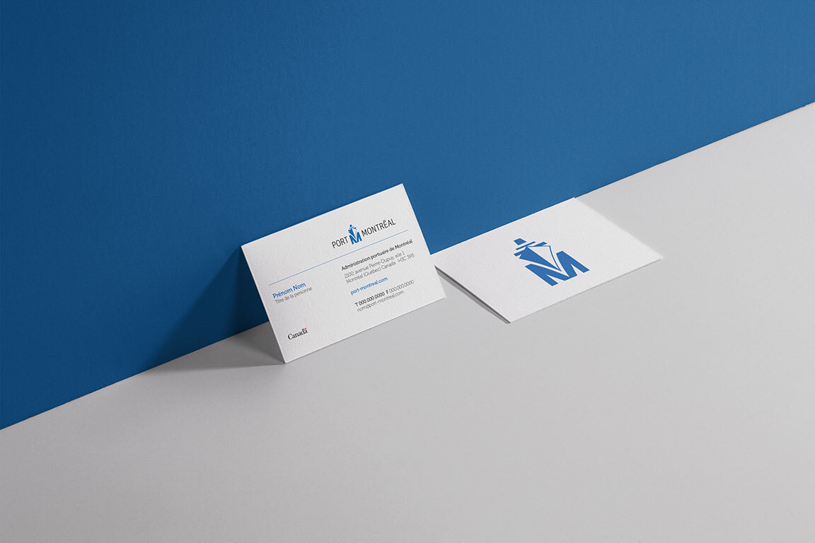
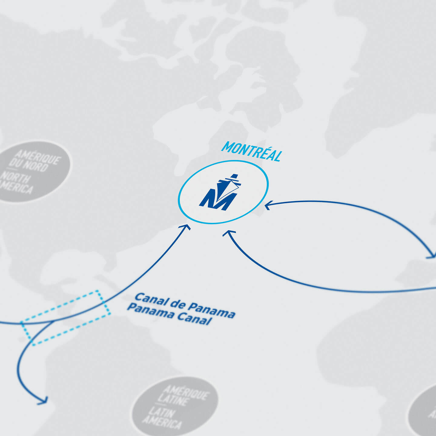
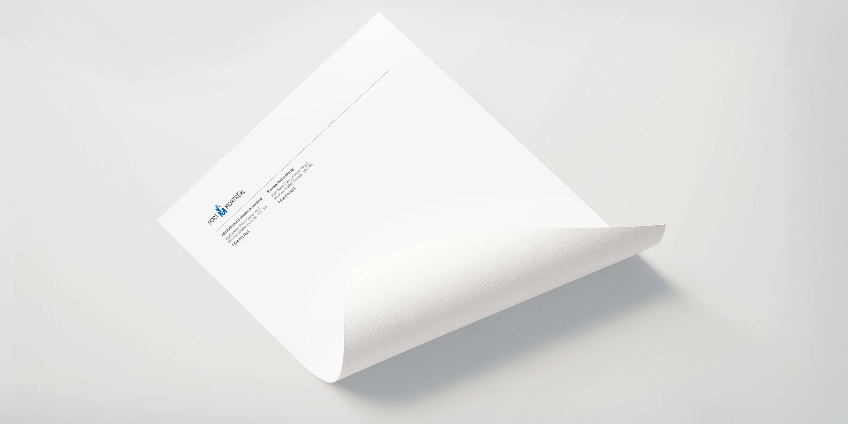
Dyade refreshed the logo using a typeface that gave it a more modern look. The ship’s image was streamlined and integrated into the Port’s signature, creating a unified logo. The logo’s new version is bilingual, with the accent in “Montréal” calling to mind the city’s Francophone culture. A style guide was also created, including standards for usage on letterheads, signage and vehicles.
Result
A consistent brand image enabling the Port to hold its own against its international competitors.
